Today consumers in every industry rely on the internet to help them make purchasing decisions, and this is just as true in the field of bail bonds as it is in other markets. A strong, positive, and productive web presence is a tremendous asset to any bail bonds company. Let’s do some analysis of this site in the bail bonds niche and provide some suggestions to increase the value of a Riverside bail bonds website to its owners.
Add An Explicit Call To Action
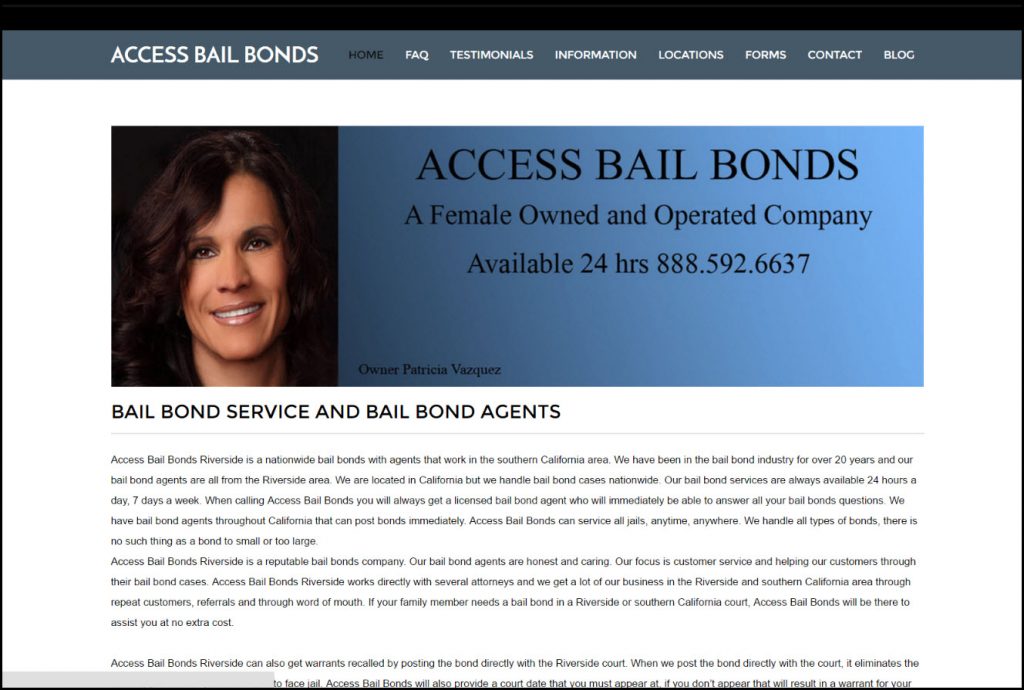
As it currently stands, the Access Bail Bonds home page is quite informative but not all that strongly organized. Information regarding the company’s services, bail bonds in general, and the company’s history is all spread out without any particular hierarchy. This could lead to visitor confusion, losing out on potential customers who find it difficult to find what they’re looking for.
The page should be reorganized around a central call to action: What step should visitors ideally take next? The information provided should all be tied into this call to action and rephrased to maximize its persuasiveness. A likely candidate for the page’s call to action would be “Call us now!” With this as the page’s top priority, all other information should be positioned to encourage visitor follow-through on the CTA.
Focus On Uniqueness, Value Proposition
A great deal of the information presented on Access Bail Bonds’ home page is helpful but rather generic. Information that could be accurately applied to any bail bond company should be shuffled off to a subordinate page.
The home page needs to focus on what makes Access Bail Bonds different from its competitors and what it has to offer its customers. This information should appear high on the page and be stated forcefully. Ideally, it should tie directly into the chosen call to action.
If the female ownership of the company is to be used as a selling point, much more can be said about how it makes the company special and allows it to offer a higher standard of service.
Keep Informative Content, But De-Prioritize It
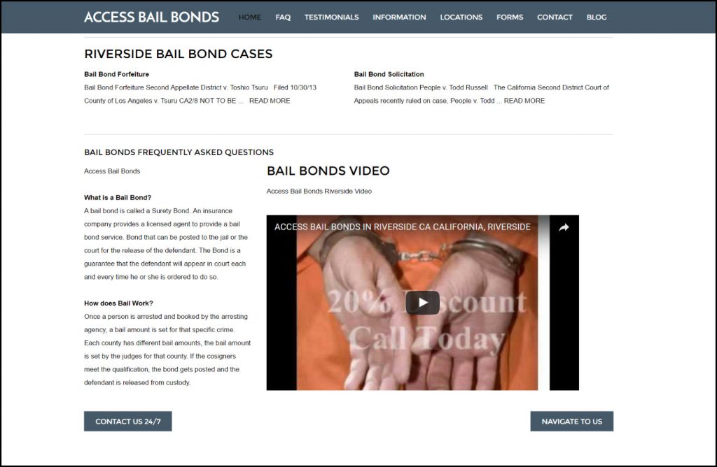
There is plenty of useful information on the home page that visitors will find helpful. As it is presented now, though, it does not serve the vital function of encouraging the visitor to do business with Access Bail Bonds. Some of this information should be relocated to other pages instead of the home page. An example of a simpler home page layout can be seen on the Tedd Wallace Bail Bonds site, where he has a clean home page and an FAQ page for questions like, “how do I get a bail bond?”
Informational content that remains on the home page should be pushed towards the bottom unless it is reworked to become more persuasive. Any such content that does remain should be optimized for search engine performance.
Cultivate A Voice, Vary The Layout
The text of the page has its fair share of grammatical errors which could be corrected with careful proofreading. The overall tone of the prose is very dry and impersonal – good for a corporate report, bad for a business attempting to make a connection with customers in need. Expressing a genuine personality through the site’s writing will help it connect with visitors.
The current layout is extremely text-heavy and unvaried. This should be broken up with more images (infographics or photos) to keep the text content in bite-sized chunks. The video which appears towards the bottom of the page should definitely be pushed up – it belongs at or close to the top.
With relatively minor tweaks, the Access Bail Bonds homepage could become a much more potent marketing tool. Above all else, it needs to make more of an effort to suggest a course of action to its visitors (e.g. calling or contacting the company) and to justify that course of action.

