Access Bail Bonds Riverside: Potential Conversion Improvements

Today consumers in every industry rely on the internet to help them make purchasing decisions, and this is just as true in the field of bail bonds as it is in other markets. A strong, positive, and productive web presence is a tremendous asset to any bail bonds company. Let’s do some analysis of this site in the bail bonds niche and provide some suggestions to increase the value of a Riverside bail bonds website to its owners.

Access Bail Bonds Riverside website

Add An Explicit Call To Action

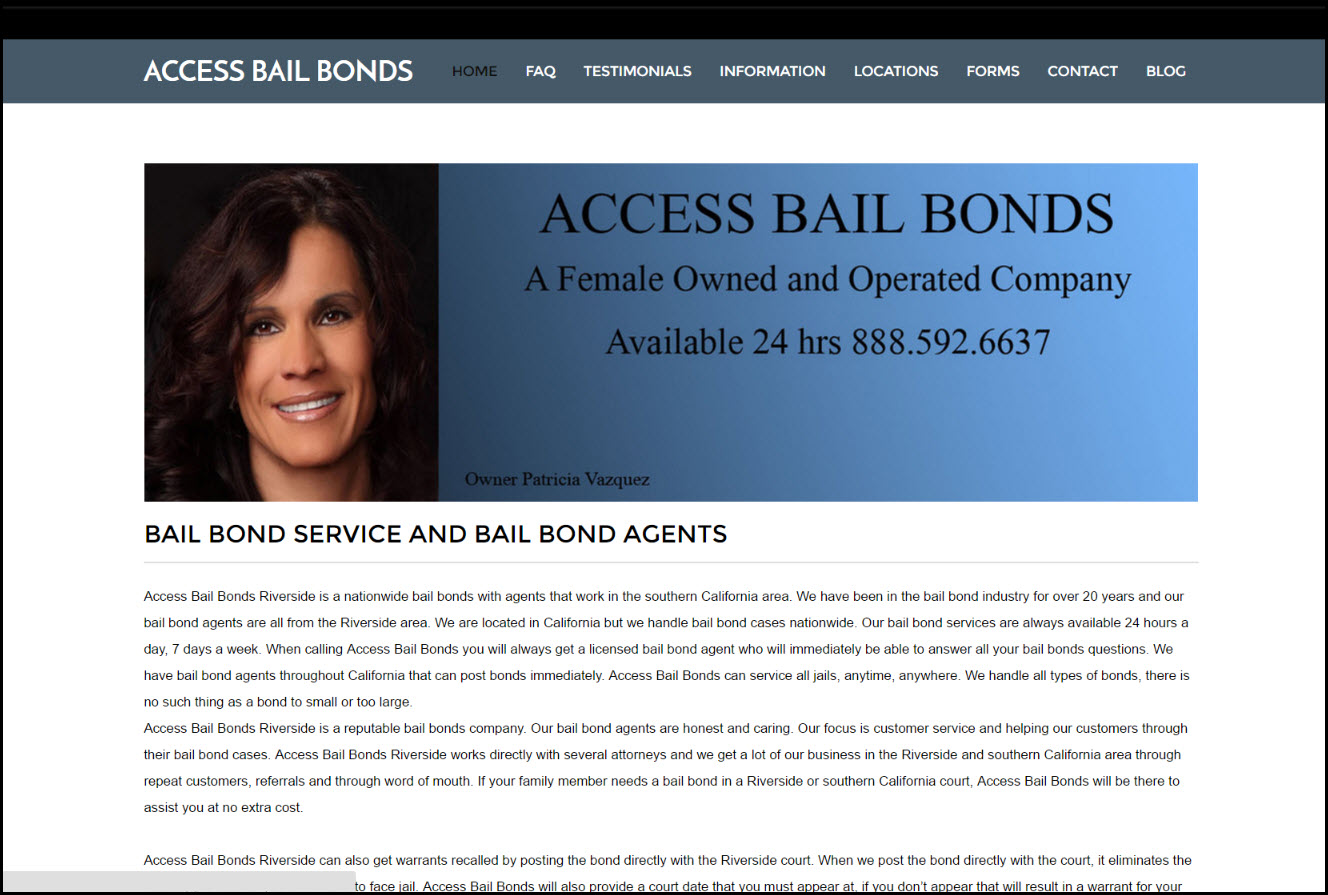
As it currently stands, the Access Bail Bonds home page is quite informative but not all that strongly organized. Information regarding the company’s services, bail bonds in general, and the company’s history is all spread out without any particular hierarchy. This could lead to visitor confusion, losing out on potential customers who find it difficult to find what they’re looking for.

The page should be reorganized around a central call to action: What step should visitors ideally take next? The information provided should all be tied into this call to action and rephrased to maximize its persuasiveness. A likely candidate for the page’s call to action would be “Call us now!” With this as the page’s top priority, all other information should be positioned to encourage visitor follow-through on the CTA.

Focus On Uniqueness, Value Proposition

A great deal of the information presented on Access Bail Bonds’ home page is helpful but rather generic. Information that could be accurately applied to any bail bond company should be shuffled off to a subordinate page.

The home page needs to focus on what makes Access Bail Bonds different from its competitors and what it has to offer its customers. This information should appear high on the page and be stated forcefully. Ideally, it should tie directly into the chosen call to action.

If the female ownership of the company is to be used as a selling point, much more can be said about how it makes the company special and allows it to offer a higher standard of service.

Keep Informative Content, But De-Prioritize It

There is plenty of useful information on the home page that visitors will find helpful. As it is presented now, though, it does not serve the vital function of encouraging the visitor to do business with Access Bail Bonds. Some of this information should be relocated to other pages instead of the home page. An example of a simpler home page layout can be seen on the Tedd Wallace Bail Bonds site, where he has a clean home page and an FAQ page for questions like, “how do I get a bail bond?

Informational content that remains on the home page should be pushed towards the bottom unless it is reworked to become more persuasive. Any such content that does remain should be optimized for search engine performance.

Cultivate A Voice, Vary The Layout

The text of the page has its fair share of grammatical errors which could be corrected with careful proofreading. The overall tone of the prose is very dry and impersonal – good for a corporate report, bad for a business attempting to make a connection with customers in need. Expressing a genuine personality through the site’s writing will help it connect with visitors.

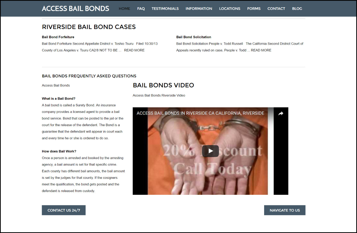
The current layout is extremely text-heavy and unvaried. This should be broken up with more images (infographics or photos) to keep the text content in bite-sized chunks. The video which appears towards the bottom of the page should definitely be pushed up – it belongs at or close to the top.

bail bonds website

With relatively minor tweaks, the Access Bail Bonds homepage could become a much more potent marketing tool. Above all else, it needs to make more of an effort to suggest a course of action to its visitors (e.g. calling or contacting the company) and to justify that course of action.

What Is The Best Way To Learn How To Code Java?

Java is used by virtually all desktop computers and in around 3 billion cellphones. If you are a coder, you need to ask yourself whether it occupies a prominent space in your resume. If it does not, you need to give your coding credentials a makeover. Java needs to be on top of your learning agenda if you plan to pursue a career in software development. If you are still not certain whether or not you need some training in Java, you can take a Java online test to check your skills.

Here are six courses to upgrade your Java coding skills and fill that gaping hole in your software developer resume.

1. Treehouse – Java Basics

Java - word spelled in 3D lettersTreehouse offers you this 3-module course to help you learn Java programming from the ground up. Build an interactive game while you learn data types, looping, conditional, and various other concepts. Module 1 provides an insight into variables and work spaces. Module 2 helps you create a game prototype and learn how to debug code. Module 3 will teach you how to establish string filters. You don’t need prior programming experience to join the course. You only have to part with $25 to access the training.

2. Creative Live/O’Reilly – Developing Android Apps With Java Parts 1 & 2

Android OS uses Java as a programming language to create killer apps. Currently, Android holds about 80 percent of the smartphone market. This course will walk you through the fundamentals of Android development. You will get to learn how to code mobile applications from start to finish. While you can buy both parts separately, it is better to take both for a fuller experience. The courses cost $99 each.

3. InfiniteSkills – Advanced Java Programming

Once you have mastered the basics, it is now time to tap the true potential of Java. Learn, then apply such advanced concepts as associative and sequential data structures, exception handling, sorting techniques, and multi-threading. Join the course and get first-hand experience on how Java experts offer solutions to problems using the robust libraries and development environments Java has. The course costs $99.

4. WiBit.Net – Programming in Java

This course is quite distinct from the rest since it is a comedy talk show under the guise of a programming tutorial. However, it still achieves its goal of teaching Java. Interestingly, its unusually fun and upbeat approach to learning does seem to connect with most of its target market. The lesson concepts are explored in a clear, light, and memorable way to learners.

5. Udemy – Java Tutorial for Complete Beginners/Java Design Patterns and Architecture

Udemy offers several free and paid Java courses ranging from primers to advanced lessons. The beginners’ course targets absolute beginners and comprises 75 lectures. The second one comprises 19 lectures and focuses on helping you to design and structure Java codes faster and better. Both courses are free and highly rated, and it is a wise idea to check them out.

6. EdX – Introduction to Programming with Java

For some individuals, the mandatory presence needed in live courses usually spells the difference between a total waste of time and successful learning experience. If you believe that you will learn better in a scheduled and well-structured environment, then this beginner class from EdX is just what you need. Therefore, check out the course’s schedule and mark your calendar.

Final Thoughts

In the world of programming, a strong dose of Java and various other programming languages does make a strong brew. After all, you have to be proficient in multiple programming languages to make the cut today. Check out the courses cited in this article or check out for other Java related courses and resources that fit your requirements. Use the Java courses to fill that gaping hole in your resume.

Website Analysis of Wilson Investigations

In this post, I’m going to be looking at http://www.wilsoninvestigations.com/ to review its overall design, layout and conversion potential, from the eyes of an experienced web developer. I will also make suggestions on how to make it easier to convert more customers.

The first thing I’m noticing on this page are the unique navigation tabs that say “Read More” on them and have a right pointing arrow. They are well done, but I’m not sure if that’s where you want the attention to go at first.

The reason people are going to pay attention to this part of the website first is because the rest of it all blends together. My first piece of advice would be to make the contact us page one of these tabs if you want people to click on that information right away to get in touch with you. That, or make the phone number on the top right a link to the contact page as well. In general, most local sites underplay these elements too much, when they should be emphasized.

Wilson Investigations WebsiteThe content on these pages is well written, and that’s great. However, people on the Internet tend to have short attention spans. You may want to take a lot of this information and make it a little less dense and add some graphics. There is little to visually interest a visitor. One suggestion that can kill a few birds with one stone would be to add a video to each page, which allows the viewer to watch and listen, rather than read through a large amount of text. This improves time on site and also makes it easier to convey your message.

The home page content is a bit thin and probably isn’t going to help much with ranking. Search engines prefer sites which have a good amount of information and not simply a list of links. As a private investigator in the Houston, Texas region, I would guess that private investigator houston is the main term which the home page should be targeting. However, although there are several variations of the term “private investigator” used on the home page, “private investigator houston” is only used once. I would recommend increasing the use of the exact term, plus add some more content to the home page.

Another thing on phone numbers. When the contact us and phone number on the pages is placed contextually in the information, I’d recommend using a header tag, such as an h2 one so you can make it larger than the text. I see that it’s bolded, but that doesn’t really draw your eye to it when there are other things that are as well around it.

It’s great that this private investigator offers a lot of services, and that there are so many to look at on the services page. One idea may be to take what the most common services are and place them near the top of these lists. I assume that is what they did with the buttons on the homepage with the arrows, but if someone comes to the page at the services area, due to how many pages there are there, it would help to make sure they know of the most popular services before anything else.

I like the contact page. It is straight to the point with phone number available and a map. People are going to appreciate not having to go to Google’s map page and get directions because they can do so right from this page.

The ‘about us’ page is okay as well, but as I go through these pages, I notice that the text is rather small, or it just looks bunched together. I would advise making the text a little larger on this about page because there is a lot of white space as it is, and people on mobile devices will appreciate not having to zoom in.

On the whole, there need to be more photo images on this website. Web users expect good imagery and images also help to convey your message via a different pathway than text is conveyed. As this is a private investigation business, it is understandable that there may be limitations on what images can be used, due to the nature of the business. But if you don’t want to have a picture of yourself on the site, then a simple alternative is to use stock images or, at least, get a picture of the building. Pages with nothing but text are very difficult to look at and will usually have poor user engagement, leading to higher bounce rates.

Overall, the website is decent and does its job. But it is definitely missing a few things. I’d probably end up using this service if I had to find a private investigator, but only after I did a little research on my own first. A big improvement would be to make the pages more user-friendly and quicker to go through. Looking at the website stats through Google Analytics to see how long people spend on the website gives a very good idea of whether visitors enjoy the site and find it interesting. If time on site averages less than half a minute, then you have some work to do.

Website Layout and Conversion Analysis – House of Hearing

It’s time for another brutally honest website review. The House of Hearing Clinic Inc website represents a local hearing aid clinic in Toronto. It is a good example of some of the common design mistakes most web designers make, which can actually have a significant impact on conversion, as we’ll see.

First of all, the site has an attractive, endless scrolling layout but there are a few issues with it that could be easily improved to make the website have a better conversion rate. Firstly, when the website loads there are several different font faces, weights and sizes available above the fold, and this inconsistency is jarring.

House of Hearing WebsiteThe ‘Call Us’ text across the top of the screen could be improved with the use of better punctuation. Perhaps writing “Call Us (Vaughan Region):” and then the phone number. This would look more professional. Adding the correct tags to make the phone numbers work with ‘click to call’ would likely increase the number of calls generated by the website slightly. As this is a local hearing aid clinic, it is more likely to get phone calls, so this feature should be well optimized.

The logo is attractive, and the image used behind the ‘Your Journey’ headline is a good one that gets the message across clearly. However, the sunset is rather bright, and the white text used for the menu is hard to read. Considering the ‘Hearing Devices’ link is one of the most badly obscured, this is a serious problem.

Easy Scrolling

The theme scrolls well, and the information presented further down the page is clear and concise. Again, there are some issues with the text that could be improved if a proofreader looked at the website. The “Hearing Test” call-out should say “We offer hearing tests for”, and under hearing aids, it should say “We carry all manufacturers and styles,” if that claim is true.

Lyric Authorized

The fact that House of Hearing is a Lyric Authorized provider is a big benefit, and it would make sense for this to be mentioned further up the page, instead of almost halfway down, since a lot of people may not choose to scroll that far.

Late Calls to Action

If you don’t respond to the call to action at the top of the page, you have to scroll a very long way to see another call to action. And the ‘Start Here’ button under the paragraph mentioning hearing test Toronto is rather understated, being in a similar color to the rest of the text that surrounds it. The same is true for the ‘Book Here’ call to action. The buttons do animate when you mouse over them, but the mouse-over is understated as well. It would be a good idea to make the call to action a little more prominent.

Transparent Contact Box

The contact us box is collapsed when you load the page, and remains collapsed throughout unless you click on it, which is a good thing. However, the box has a transparent header, which looks messy when there is something underneath it, and this could put users off exploring the rest of the site. The 2015 copyright notice at the bottom of the site may want to be updated with 2016, and should be in a different font size because the text is unclear on a laptop screen.

The site does look good at a range of different screen sizes, but there are a lot of problems with it. The lack of a click to call and the fact that the email address at the bottom of the page in the footer is not clickable are things that will reduce the conversion rate of the site significantly. It would not take a lot to put those issues right.

The presence of social media links at the bottom of the page is a plus, although moving them to the top of the page on blog posts and other parts of the site would be wise to increase the frequency with which those links are being used.

Overall, this is a good site, but there could be some improvements made.