It’s time for another brutally honest website review. The House of Hearing Clinic Inc website represents a local hearing aid clinic in Toronto. It is a good example of some of the common design mistakes most web designers make, which can actually have a significant impact on conversion, as we’ll see.
First of all, the site has an attractive, endless scrolling layout but there are a few issues with it that could be easily improved to make the website have a better conversion rate. Firstly, when the website loads there are several different font faces, weights and sizes available above the fold, and this inconsistency is jarring.
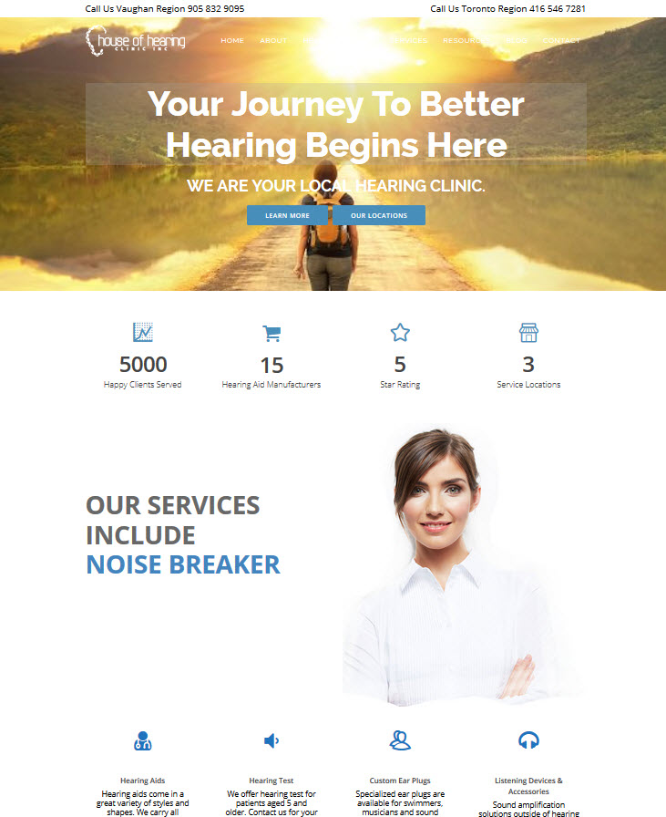 The ‘Call Us’ text across the top of the screen could be improved with the use of better punctuation. Perhaps writing “Call Us (Vaughan Region):” and then the phone number. This would look more professional. Adding the correct tags to make the phone numbers work with ‘click to call’ would likely increase the number of calls generated by the website slightly. As this is a local hearing aid clinic, it is more likely to get phone calls, so this feature should be well optimized.
The logo is attractive, and the image used behind the ‘Your Journey’ headline is a good one that gets the message across clearly. However, the sunset is rather bright, and the white text used for the menu is hard to read. Considering the ‘Hearing Devices’ link is one of the most badly obscured, this is a serious problem.
Easy Scrolling
The theme scrolls well, and the information presented further down the page is clear and concise. Again, there are some issues with the text that could be improved if a proofreader looked at the website. The “Hearing Test” call-out should say “We offer hearing tests for”, and under hearing aids, it should say “We carry all manufacturers and styles,” if that claim is true.
Lyric Authorized
The fact that House of Hearing is a Lyric Authorized provider is a big benefit, and it would make sense for this to be mentioned further up the page, instead of almost halfway down, since a lot of people may not choose to scroll that far.
Late Calls to Action
If you don’t respond to the call to action at the top of the page, you have to scroll a very long way to see another call to action. And the ‘Start Here’ button under the paragraph mentioning hearing test Toronto is rather understated, being in a similar color to the rest of the text that surrounds it. The same is true for the ‘Book Here’ call to action. The buttons do animate when you mouse over them, but the mouse-over is understated as well. It would be a good idea to make the call to action a little more prominent.
Transparent Contact Box
The contact us box is collapsed when you load the page, and remains collapsed throughout unless you click on it, which is a good thing. However, the box has a transparent header, which looks messy when there is something underneath it, and this could put users off exploring the rest of the site. The 2015 copyright notice at the bottom of the site may want to be updated with 2016, and should be in a different font size because the text is unclear on a laptop screen.
The site does look good at a range of different screen sizes, but there are a lot of problems with it. The lack of a click to call and the fact that the email address at the bottom of the page in the footer is not clickable are things that will reduce the conversion rate of the site significantly. It would not take a lot to put those issues right.
The presence of social media links at the bottom of the page is a plus, although moving them to the top of the page on blog posts and other parts of the site would be wise to increase the frequency with which those links are being used.
Overall, this is a good site, but there could be some improvements made.